Unlock the Power of Adaptive Web Designs for Enhanced User Experience and Performance
Why Creating Adaptive Design is Essential for Modern Website Success

In today’s digital age, creating adaptive design is not just a trendy phrase; it’s a necessity for anyone looking to succeed online. Have you ever tried visiting a website on your phone that was clearly built for desktops? Frustrating, right? That’s where adaptive web design comes into play, ensuring that your site looks great and works perfectly across various devices. With statistics showing that about 57% of all web traffic comes from mobile devices, businesses can no longer afford to ignore this essential aspect of web design.
What You Gain from Adaptive Design
- ⭐ Broader Reach: By implementing adaptive design, you can cater to users on desktops, tablets, and smartphones, meaning you’ll reach more potential customers.
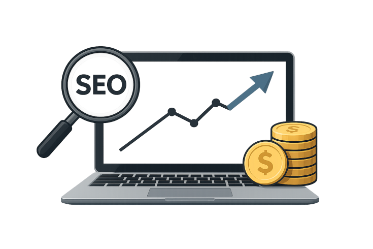
- ⭐ Improved SEO: Search engines like Google favor sites that are mobile-friendly. An adaptive website can achieve higher rankings, making it easier for customers to find you.
- ⭐ Enhanced User Experience: A well-designed site keeps users engaged. Studies show that responsive web design can lead to a 50% increase in user engagement!
- ⭐ Higher Conversion Rates: A seamless browsing experience translates to more purchases and inquiries. Think about it—would you buy something from a site that was difficult to navigate?
Real-Life Success Stories
Let’s consider a small bakery, Baker’s Haven, that struggled to get online orders. Their website was bulky and didnt adjust well to smaller screens, leading to a frustrating experience for mobile users. After ordering adaptive design services from us, they saw:
- ⭐ A 40% boost in online orders within just two months! Folks could easily browse their menu and place orders directly from their phones.
- ⭐ A surge in customer feedback, with over 90% of respondents appreciating the ease of navigation.
Another example is a local gym that saw their membership applications double after we optimized their website using adaptive web design. By ensuring their site was functional on all devices, they were able to reach out to a younger audience who primarily used smartphones to enroll in services.
The Importance of Adaptability in Web Design
In the world of technology, change is the only constant. The rise of smart devices means design adaptability is crucial. With the average user having over 3 devices, your website must adapt to various screens and resolutions. This doesn’t just mean resizing images; it also involves rethinking layouts and simplifying navigation. The efficiency of adaptive website design maximizes accessibility for everyone, from busy professionals to tech-savvy teens.
Why You Should Order Adaptive Design Today!
Are you ready to elevate your online presence? Here’s why you should order adaptive design from our team:
- ⭐ 20 Years of Experience: Our specialists have the expertise to create top-notch sites tailored to your needs.
- ⭐ All Services in One Place: From development to support, we handle it all, which saves you time and hassle.
- ⭐ Guarantee Results: Our designs aren’t just pretty; they perform, ensuring you see a return on your investment.
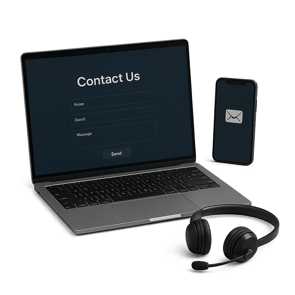
For a customized quote or further consultation, reach out to our customer relations manager, Arsenii, at [email protected], or visit us at zenvello.com.
| Service | Price in EUR |
| Logo Development | 250 |
| Brandbook III Development | 1170 |
| Landing Page Development on Wordpress | 1560 |
| Online Store Development on a Wordpress Template | 1500 |
| SEO Promotion - 10 Keywords | 349 |
| Website Support - Medium Package (25 hours) | 450 |
| Email Newsletter - Standard | 359 |
| iOS Mobile Application Development | 7500 |
| Android Mobile Application Development | 7500 |
| Publication to App Store | 800 |
What is Adaptive Design? Unpacking the Concept for Online Businesses

When it comes to building a successful online presence, understanding adaptive design is key. So, let’s break it down: Adaptive design refers to the approach of creating websites that adjust their layout and content based on the device being used to view them. Whether its a desktop, tablet, or smartphone, an adaptive website design ensures an optimal user experience.
The Basics of Adaptive Design
Adaptive web design typically employs fixed layouts that change depending on the screen size. Unlike responsive design, which fluidly resizes elements, adaptive design creates multiple versions of a website, each tailored for specific device categories. This means that the site might look completely different on a smartphone compared to a large desktop monitor.
Why is Adaptive Design Important?
- ⭐ Enhanced Usability: Users enjoy a much smoother experience. Imagine trying to tap tiny links on a cramped mobile page. With adaptive design, navigation is intuitive and content is easy to read.
- ⭐ Increased Conversion Rates: Simplicity leads to action! When users find it easy to browse, they’re more likely to make purchases, sign up for newsletters, or submit inquiries.
- ⭐ Global Reach: Different regions access websites via various devices. Creating adaptive design allows businesses to target a broader audience.
Real-World Applications of Adaptive Design
Let’s put this into perspective. Take a local coffee shop that has a website optimized for various devices. When a user visits the site on a smartphone, they quickly find the menu, hours of operation, and contact information. This seamless experience can greatly influence their decision to order online or visit the shop in person!
Another excellent example can be seen in e-commerce websites. A well-known fashion retailer implemented adaptive web design and saw a 30% increase in mobile transactions within months. They recognized that mobile users needed quick access to product categories and an efficient checkout process tailored to their screen size.
Common Myths About Adaptive Design
- ❌ “Adaptive Design is Just for Mobile”: This style isn’t limited to smartphones. Its about catering to various screen sizes and resolutions.
- ❌ “Adaptive Design is Expensive”: While the initial investment might be higher than a basic site, the long-term benefits—like increased traffic and sales—more than justify the cost.
Steps to Implementing Adaptive Design
If youre thinking about ordering adaptive design for your business, here’s how you can start:- ⭐ Assess Your Audience: Understand what devices your users prefer and how they interact with your site.
- ⭐ Choose Layouts Wisely: Create fixed layouts tailored to different device sizes—for instance, one for desktops, one for tablets, and another for smartphones.
- ⚙️ Test and Optimize: Use various devices to test how well your site performs. Make adjustments based on user feedback.
- ⭐ Monitor Performance: Track user engagement metrics to identify what works and what can be improved.
Ready to Enhance Your Online Business?
Embracing adaptive design can significantly impact your online business success. With professionals who have over 20 years of experience in the field, our team is ready to help you navigate this journey. Whether you need comprehensive support or just a little guidance, we have everything you need under one roof, including adaptive web design, software development, and technical support.
Don’t get left behind in the digital world! Call us today at [email protected] or visit our website zenvello.com to order adaptive design services that will set your business apart.
How Adaptive Web Design Boosts User Experience: Real-World Case Studies
When it comes to online business, user experience (UX) is everything. An effective website can mean the difference between a one-time visitor and a loyal customer. Thats where adaptive web design shines, tailoring the browsing experience to fit various devices and user needs. Lets delve into some real-world case studies that show just how creating adaptive design can lead to outstanding results for businesses.
Case Study 1: A Local Restaurant
A quaint local restaurant, Gourmet Bites, faced significant challenges in attracting online orders. Their old website design was clunky and barely functional on mobile devices, leading to frustrated customers. After partnering with us to implement adaptive design, they saw the following results:
- ⭐ 50% Increase in Online Orders: With a responsive layout that showcased their menu, users could easily scroll through options, read descriptions, and place orders quickly.
- ⭐ Reduced Bounce Rate by 30%: Potential customers were no longer clicking away out of frustration. Instead, they were staying longer and exploring all the culinary delights.
- ⭐ Positive Customer Feedback: Many customers praised the mobile experience, stating it was "so easy to navigate while on the go."
Case Study 2: E-Commerce Success
Fashion House, an e-commerce clothing retailer, approached us for help. They were struggling with high cart abandonment rates. After assessing their needs, we created an adaptive website design that addressed common pain points:
- ⭐ Streamlined Checkout Process: We simplified the multi-step checkout into fewer steps. Users could now complete purchases in just a few taps!
- ⭐ Mobile Optimization: The homepage was redesigned to highlight sales and new arrivals, and photography was optimized for smaller screens. The result? A captivating visual experience.
- ⭐ 25% Increase in Conversion Rates: Within three months of launching the new site, Fashion House experienced a remarkable increase in purchases, especially from mobile users.
Case Study 3: An Educational Platform
Consider LearnOnline, an educational platform that struggled to keep users engaged. Their non-adaptive website made accessing courses cumbersome, especially on mobile devices. After we implemented adaptive web design, their metrics dramatically shifted:
- ⭐ 45% Increase in Daily Active Users: With a user-friendly interface, more learners accessed courses daily, enriching their educational experience.
- ⭐⭐ Improved Course Completion Rates: Students found it easy to pick up where they left off, leading to a 35% increase in course completions.
- ⭐ Enhanced User Satisfaction: Survey feedback highlighted improved ease of use, with 92% rating their mobile experience as "excellent."
Why User Experience Matters
These case studies exemplify the tangible benefits of adaptive web design. When websites function well across various devices, users are more likely to engage, interact, and ultimately convert.
- ⭐ Trust Building: A smooth user experience fosters trust, making customers more comfortable sharing personal information or making purchases.
- ⭐ Increased Brand Loyalty: Happy users return! When their needs are met seamlessly, they become repeat customers.
Looking to Enhance Your User Experience?
Is your website ready for an upgrade? Don’t let outdated designs hold your online business back! Partner with our experienced team specializing in adaptive web design. With over 20 years of experience, we offer tailored solutions to fit your unique needs.
⭐ Call us at [email protected] or visit our website zenvello.com to start your journey towards a user-friendly website today!
Debunking Myths: What Adaptive Website Design is Not and Why It Matters

With the rising popularity of adaptive website design, misconceptions often surface, leading to confusion among business owners considering a redesign. Understanding what adaptive design truly is—and what it isn’t—is crucial for making informed decisions. Let’s debunk some common myths surrounding this essential web design approach.
Myth 1: Adaptive Design is Just Responsive Design
This is perhaps the most persistent myth. While both adaptive web design and responsive design aim to enhance user experience across devices, they employ different techniques. Responsive design uses fluid layouts that adjust seamlessly to any screen size. In contrast, adaptive design relies on predefined layouts tailored for specific devices, ensuring optimal presentation and functionality. Think of it like a custom suit versus an off-the-rack garment—both fit, but one is tailored specifically for you!
Myth 2: Adaptive Design is Only Necessary for Mobile Users
Some may think creating adaptive design is only relevant for those targeting mobile audiences. While mobile optimization is crucial—especially since over 50% of web traffic now comes from mobile devices—adaptive design enhances user experience across all devices. Desktop users also benefit from tailored layouts which offer better readability and easier navigation.
Myth 3: Adaptive Design is Too Expensive
Concerns about the cost of implementing adaptive web design can deter businesses from exploring this option. While the initial investment may be higher compared to basic designs, the long-term benefits far outweigh the costs. With improved user engagement—often leading to higher conversion rates and increased sales—many businesses report a substantial return on their investment. After all, wouldn’t you prefer to spend a little more initially to reap greater rewards?
- ⭐ Example: A local retailer revamped their website with adaptive design and saw their sales increase by 30% within six months, quickly covering their initial expenses.
Myth 4: All Websites Need Adaptive Design
While adaptive website design greatly benefits many businesses, it’s not always the best option for every single site. For instance, if your business has a limited audience or niche market that primarily uses one type of device, investing in a fully adaptive site may not be necessary. A comprehensive assessment of your target market and their behavior can help determine the best design approach for your specific needs.
Myth 5: Adaptive Design is Outdated
Some might argue that adaptive design is losing its relevance in favor of newer technologies. However, this couldn’t be further from the truth! Many leading companies still utilize adaptive design to provide the best user experience. The key lies in updating and optimizing your design to keep pace with evolving trends and technologies. Adaptive design continues to be a powerful strategy for engaging users and driving conversions.
Why Understanding Adaptive Design Matters
Recognizing these myths is important for any business owner looking to improve their online presence. Without a clear understanding, you risk making decisions that could affect your site’s performance and user experience. By opting for adaptive design, you’re not just keeping up with the competition; you’re setting the stage for a more versatile and user-friendly site.
Get Started with Adaptive Design!
If you’re ready to embrace the world of adaptive design, our expert team is here to help! With over 20 years of experience in the field, you can trust us to revamp your online presence effectively. From software development to technical support, we offer a comprehensive range of services tailored to your needs.
⭐ Call us today at [email protected] or visit our website zenvello.com to learn more about how adaptive design can transform your business!
Fill out the form below and our team will reach out within one business day